"Tempus combines all three elements of graet cinematography; art, creativity and of course Time-Travel!"-Chloe Marjot, Co-Director of Tempus and Supporting Actress.
Co-Director of Tempus Speaks to us about their PR:
When it came to deciding
about what to create when we started thinking about the poster. We took on a lot
of thoughts and ideas and realized that the main concept was the fact that we
have no idea who “The Shadower” is. So we thought quickly and Rachel thought
that the best thing to do was to have an anonymous silhouette. We thought that
the best thing to do was to probably put the Mise-en-Scene into the picture. The
fact that he is standing against a wall highlights this idea that the main
character: Alex, always seems to hit a wall when it comes to the understanding
of who “The Shadower” is. We thought that the best thing to do was to keep the
poster as simple as we could as the more complex a poster is the less intriguing
it is. The poster was extremely effective in the fact of advertising the Film. It
was successful in the fact that when we showed people they started to ask
questions and soon looked up what Tempus meant. Which they soon came to find
out it is Latin for Time.
The Magazine Review The Magazine Review was inspired by the likes of Empire Magazine.
In Detail of its Effectiveness:
The
effectiveness of the Magazine review was the fact that the picture is extremely
eye catching and the use of a colloquial unbiased article raving the film and
the combination of the interview as well created a very amusing and easy to
read article. This way it showed off the Film to be fairly easy to watch. And because
we raved about it in the review it then would become a word of mouth situation
people would ask “Have you seen this article on the upcoming movie Tempus?”
This is the
whole point of the Ancillary Tasks it was to boost your confidence as the
production companies PR associates to rave and get as many people to come and
see your film as much as you can.
I think
that the combination of the ancillary tasks and the Main Product created a
fantastic package and a beautiful work of art. Showing off each of the group
members strengths!
It's similar to the previous one, except I've rearranged some audio levels. After receiving feedback from people whom were shown this film, they all said the audio at the start over-powered the narration and that Alex 2 was too quiet. Hopefully, this has been fixed in this render.
Though the lack of voice-over made it more mysterious, it also left the audience clueless. I've added the voice-over back in. It fits with the narrative quite well, like Alex is explaining the story to the therapist.
This is our final piece. We changed the script, yet again, to make it more serious and mysterious. Still the same concept as the previous piece, but this leaves more for the audience to figure out. The camera shots are not only more visually pleasing, but also add to the story, through use of angles. I added to and improved the video effects. Especially the Skype call. It looks a lot better than the previous one, which had no FX and looked horrific. In terms of sound, I removed the voice over. This makes the film more mysterious. I also added music. It helps the film flow and influences the audience as to what they should feel.
Looking into film posters and advertising for films has become intresting as each and every film has a differnt twist and way to grab peoples attention. Most genres use the same bassic ideas like in their film posters they will include blood or a scary image etc using colours like reds and blacks and so on. Where as a romantic comedy would use the traditional colours of reds and pinks. Some posters work well others do not, as displayed bellow there is an uneffective poster.
This film poster was designed for the film 'Meet the Fockers', although this has all the basic needs of a film poster such as the main characters in it and an image of the main character it lacks imagination and originality. The plain background isn't very appealing and the simple image doesn't tell you much about the characters and doesn't draw you in to making you want to watch the film. It simply looks like a bunch of normal people who live a normal life. Also the font style was a very basic text which again doesn't draw anyone in. I would change the main image on this poster along with the font style and use brighter colours and relate it more to the story line. An example of an effective film poster is displayed bellow. These images work well together along with the style of righting and colours used. You can tell this film is to do with the main characters on the front of the posters as they are clearly displayed. The images have been photo shopped well and made to look perfect brightening the colour of the peoples eyes which makes it eye catching. The way the text is laid out also worked effectively as it look almost like and equation which again links to the film and its genre. The positioning works well too as the title splits the two people apart helping the genre once again and making the font and images stand out and work well together.
This is a very rough outline of my first idea for our film poster, the idea of having the time traveller in the background with his good up either covering his face or having is back to the photographer is to get the point out that they are mysterious and you shouldn't know who they are. The main protagonist is to make sure they stand out so the person looking at the poster they can tell who the main character is. I haven't decided the font I want to use for the tittle but I will look on sites such as defont to get lots of new ideas but I defiantly want a sting front that relates to the tittle; as it's to do with time I want the title to fade maybe or have some kind of effect that supports this. As for including actors/actresses names of who is in it I will place that with all the information such as what star rating news papers etc. have given it.
As you can see in the college of posters above there are many different styles depending on the genre of the movie; although some posters have a recurring theme when it comes to the information displayed on it. Commonly posters consist of a photograph or illustration (spending how the film is made either by film or animation) of the main characters. All these images are Hollywood cinema films and none are really seen as a short film. Not many short films are advertised in the same way as for example a Hollywood blockbuster would be.
These are what I would suggest is essential in a film poster :
- the title of the film
- and image or illustration of main characters or a scene from within the movie
- people's names who are starring in the movie
- something intriguing that doesn't give away too much; something that provides enigma
Film posters and other posters are now also being used for different products such as cd covers and t-shirts. The point from this being posters are now no longer used just for advertising but also we be hung in people's bedrooms wall almost as a price if merchandise from their favourite film.
The image above is of an example of this happening. The very famous film jaws have printed their posters onto t-shirts that people can buy, reasons for this maybe a simple as the like the image or the movie itself but sometimes people even buy t-shirts like this purely because they like the look of it; creating the idea advertising isn't always about the product especially when it's for a film or music.
-RM
People have started to use Film posters to re-create some very creative and hilarious art pieces. For example the picture below:
This is a photograph by Photographer: David Eger.
He re-creates film posters and historical moments whilst using Star Wars figurines this is The Wizard of Oz and he used Chewbacca as The Cowardly Lion, Princess Leia as Dorothy, C-3PO as The Tin-Man and Han Solo as The Scarecrow. A hysterical piece of art work.
People often use Movie Posters or famous photographs from movies in cards and invitations. One of the most used Photographs is of Audrey Hepburn in Breakfast at Tiffany's the picture is her on a birthday card:
The photograph is the most important thing about the film poster in my opinion. This is the image you are using to advertise your film to the public therefore it needs to try and represent the film in one image. You don't want to use a photography of something that gives away too much otherwise people wont feel the need to come and see it. I am currently in the process of the image I want to use in the film poster as I want to make sure I get it right. I am stuck between two image that are totally different and have two different feels to them.
The first image I am thinking about using is one of all the boys who play Alex throughout the film at different ages. The thing I like about this is you can immediately see the connection of these boys which is essential for the viewer however the picture looks more like a family photo and it may give off the wrong impression of our film. The second image was of the time traveller with his head down so you cant see his face at all and is dressed head to toe in dark colours. This image shows this figure as mysterious and works well creating tension.
Below is some example of good film posters
The Dark Knight Rises For a Good Time Call... Now is Good
I think all these posters are good as they get across all the information film posters should and used an image effectively. One thing that's important s the lay out of the poster as this is essential in order for the poster not to look too crowded.
The image I use for our film poster needs to be as effective as all these ones in order to achieve what I want from this part of the advertising.
This video is one of the things I watched in order to gather research on how to make an effective movie poster...
Getting the image right - Not giving too much away - Attracting peoples eye so they want to go see the film - Informing people what actors/actresses are in the film - Informing people who was the directors etc who created the film - Using the space well and not overcrowding the poster with text - Using colour well, not too much or too little - Making sure a good font is used - Make sure ALL important information is on there - Contrast between the text and picture
I started to look at a few more movie reviews and when I looked at where the pictures were presented I realised that they often had a quotation in the corner or slap bang in the middle of the picture. So I chose one of the interesting things that we had said and chose: "It Creates a Goblet of Questions, Before, During and After the Film." I thought that this would draw the readers in as it's quite articulate and interesting it makes you wonder what kind of questions that would have to be asked and starts to make the reader want to watch the movie so they can start to think of the questions they should ask.
CM & RM
Me and Rachel have been focusing on the magazine review together we combined both our skills to get the best possible outcome.
We each brought different skills when it came to creating the review, Rachel was able to bring her expertise in the design and all the fabulous pictures she had taken throughout the filming process. I was able to bring the creative writing aspect to it. I decided to take on the role of a colloquial text-such as the ones in Empire magazine. Rachel and I liked the idea of having a review and including an interview as well. As we both thought this would create an interest for the readers.
Rachel liked the idea of having the text surrounding the picture and she came up with the idea of a montage of photos instead of one big photo. She said this would be more effective for the reader and also the condition of the photos will be better if they're smaller rather than being a massive photograph. It also shows the different stages that we went through in the process of the film.
CM & RM
Wednesday, 22 January 2014
Re filming the ending was probably the most important part we needed to redo. My idea was to film in the schools conference room so that it looks like a proper professional office. Being as Chloe played a therapist she needed a proper office to make it look realistic and the best place to find an office was in our school. As the conference room was busy at the time we used the head teachers office as we needed a big enough place to be able to edit the two different Alex's into the shot. Below is a picture of us setting up the cameras in the office we used
The distance between the two characters worked well with this long desk as it made the therapist look more intimidating. The aim was to make this character look intimidating so that the audience sympathises with Alex and his confusion.
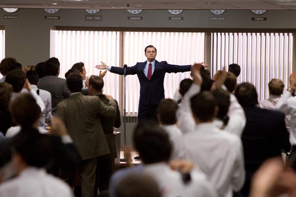
The acronym is, appropriately, WOWS. The Wolf of Wall Street is a film of yuppie pastels in the bright light of the world’s vacation spots, so crisp as to seem slightly unreal. It’s three hours of wall-to-wall bunga-bunga partying, with orgiastic excess that evokes Jay-Z’s ‘Big Pimpin’’ music video, Bob Guccione, John Casablancas, von Stroheim and Cecil B. DeMille.
USA 2013 Certificate 18 179m 55s Crew Director Martin Scorsese Produced by Martin Scorsese, Leonardo DiCaprio, Riza Aziz, Joey McFarland, Emma Koskoff Screenplay Terence Winter Based on the book by Jordan Belfort Director of Photography Rodrigo Prieto Edited by Thelma Schoonmaker Production Designer Bob Shaw Sound Mixer James Sabat Costume Designer Sandy Powell Cast Jordan Belfort Leonardo DiCaprio Donnie Azoff Jonah Hill Naomi Lapaglia Margot Robbie Mark Hanna Matthew McConaughey Manny Riskin Jon Favreau Patrick Denham Kyle Chandler Max Belfort Rob Reiner Jean-Jacques Saurel Jean Dujardin Dolby Digital/Datasat/SDDS In Colour [2.35:1] Distributor Universal Pictures International UK & Eire thewolfofwallstreetuk.tumblr.com UK release date 17 January 2014
Stockbroker Jordan Belfort, the ‘wolf’ of the title (played by Leonardo DiCaprio), thrives as master of ceremonies in a milieu where the only self that matters is the performed self. Like a great number of Scorsese protagonists with whom he otherwise wouldn’t seem to have much in common, including Travis Bickle and Rupert Pupkin, Jordan only exists when validated in the eyes of the world. The offices of Stratton Oakmont aren’t just a workplace for Jordan, but his own private public theatre, a place where he can stalk the boards, reassuring himself of his own success by re-enacting the legend of it.
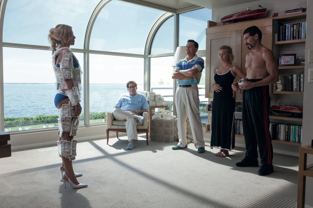
When preparing to step down in return for clemency from the Securities and Exchange Commission, Jordan reneges in front of his office – he realises that if he ceases to be Stratton Oakmont, he ceases to be. When Jordan’s lieutenant Donnie Azoff (Jonah Hill, wearing bleached teeth and playing a version of Jordan’s real-life accomplice Danny Porush) needs to prove a point, he makes a soapbox of the nearest handy desk and acts out his power play in full view of the ‘wolf pit’, eating one hapless employee’s goldfish, or pissing on a subpoena. With the offices the scene of many a group grope, even sex isn’t private.
Jordan is a born bullshitter and, like many bullshitters, he has the gift of inspiring supreme confidence. In the business of selling speculation, talk is the coin of the realm, and The Wolf of Wall Street is enamoured of palaver, from the Texas smooth talk of Matthew McConaughey, playing Jordan’s mentor Mark Hanna, to the blue-collar New York Jewish patter of Rob Reiner as Jordan’s towering, hotheaded father. Loaded with thrilling verbal runs, this film is the nearest thing to a pure comedy that Scorsese has made since 2006’s The Departed.
Based on Belfort’s own memoir and written for the screen by Terence Winter, Wolf lacks The Departed’s suspense-making genre architecture. The film is essentially a chain of anecdotes: Jordan interrogating his gay butler for money that went missing during a sex party; Jordan using the family of friends to transfer money into Swiss bank accounts; Jordan’s yacht capsizing when crossing the Mediterranean in a mad rush to retrieve the money from those same accounts. Along with its three-hour runtime, this baggy plotting may make Wolf a somewhat harder sell to audiences but it’s a deeper movie than The Departed – among the best that Scorsese has made.
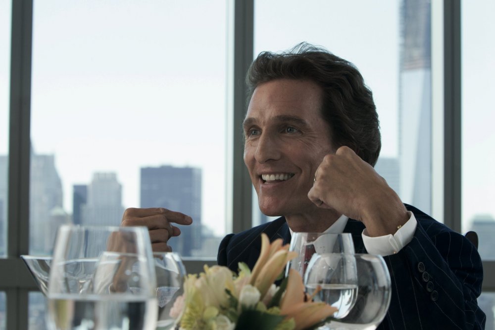
The comedy here isn’t only verbal but also physical, and it’s in this department that DiCaprio’s performance enters the realm of the undeniable. There’s his rubber-torsoed dancing at his wedding party, much giffed since appearing in the film’s trailer, and the elaborate seduce-and-stick-it-in pantomime he enacts while illustrating how to high-pressure sell a cold call via speakerphone. As McConaughey’s character makes explicit in an initiation that hangs over the entire film, sexual release is only a means to prime the pump so as to make more money – the Stratton Oakmont gang even equate different classes of prostitutes with different grades of stocks.
One elaborate physical comedy set piece is the movie’s hysterical high point. It involves Jordan and Donnie incapacitated by elephant-tranquiliser-grade ‘Lemmon 714’ Quaaludes in a moment of crisis that demands fast action and quick thinking. The sight of Jordan desperately trying to get back home, wriggling on his belly towards his Lamborghini Countach and opening the passenger-side scissor door with his foot, made this critic laugh harder than anything else in films in the past year.
When drugged Jordan intercepts drugged Donnie during an ill-advised incriminating phone call, both men wind up flailing at one another on the ground, speech slurred, tangled in the telephone cord, looking like nothing so much as two newborns in a playpen – which, of course, they are, except that the playpen is seven acres on the Gold Coast of Long Island, Jay Gatsby country, the most expensive real estate in the world.
Jordan has a nobler conception of himself. Introducing the shoe designer Steve Madden, whose company Stratton Oakmont is about to take public, Jordan identifies Madden as an artist, the artist’s gift being that he “creates trends”. By Jordan’s own definition, then, his market manipulation is a variety of artistry – and the scenes where Jordan rallies his bullpen to do his bidding are unexpectedly touching in their evocation of the esprit de corps among business-world brigands. Like The Wolf of Wall Street, they are at once energising and enervating, the very centre of a movie that fairly reeks with the sweet stench of success
Heat Magazine
This year's BAFTA Film award nominations, and Gravity's up for 12! Not bad, eh?
Happy BAFTA Film Award Nominations Day to one and all!That's right - today is the day we find out who's up for what in the annual BAFTA Film awards, and it sure is looking good for the cast and crew of space drama Gravity.
The film, starring Sandra Bullock and George Clooney, is up for 12 whole awards, including Best Film, Outstanding British Film, Best Actress for Sandy, and Alfonso Cuaron is up for Best Director.
Talking about the film, Sandra told Magic FM how working with George made the filming process so much more enjoyable. She said: "We've known each other for over 20 years, and there's no one I'd rather do it with because we both knwo the joke; we both know what it is; we both don't get offended by it. He's a good man - so great in this industry because he loves it so much
YouTube reviews:
By Beyond the Trailer
By ErikWithNoK
I really like reviewing a film by filming it as an interview. I think it's effective and people are more likely to watch them than go and buy a film magazine. Also when it comes to YouTube people search a keyword and that video will show up so it's more likely to get watched. They can also be reviewed by amateurs or by professionals.
When I write the review I want to attempt to engage the readers:
By a quoting the film like in Dirty Dancing a lot of reviewers used the famous quote "No one puts Baby in the corner!"
By finding the title and then in italics underneath summarising the film in a few words:
The House I Live In Eugene
Jarecki's devastating doc
Comment on the Acting/Voice skills,
Comment on the Director,
Comment on the Producers/Production Companies,
Include Memorable quotes,
Include the Release Date
Rate it out of 5 stars
A short Synopsis that doesn't give away too much of the movie
Outline of a Magazine Review:
Title: Includes the movie title
Subtitle: optional, but a great way of using the clever slogan like a movie quotation or a play on words
Opening Hook: Tease the Reader with a quote, or a question
Body: Synopsis, Facts, Opinion (in my case as I'm reviewing my own movie I think it's best to try and write it in the most unbiased way possible but this can be quite hard to do)
Conclusion: recommend it or warn against it
Yahoo.com say that these are the top 4 tips on how to write a successful Movie Review:
~Tips on Writing a Successful Movie Review 1. Make it apparent what movie you are reviewing right from the beginning. You don't have to necessarily include this in the opening paragraph, but you need to include it in the title. Online writing makes this step easy, and besides, you want to include the movie title in the article title if you ever want anyone to read your movie review anyway.
2. Try not to immediately say what you thought of the movie if you want the reader to keep reading the whole movie review since your opinion on the movie is the entire reason that the reader is looking for a movie review in the first place.
3. Actually watch the movie first. I know, I know. That sounds like commonsense, but it wouldn't surprise me that people would try to write about movies they haven't seen. IMDB might be a great resource for fact-checking, but you actually have to see the movie to develop an actual opinion of the movie, which you need to write a successful movie review.
4. This tip goes back to the mistake I made in writing the movie review: don't use phrase like 'in my opinion'. It doesn't ruin it, but it is totally unnecessary and repetitive to say 'in my opinion' or 'I think'. The reader already knows that you think such-and-such or that it is in your opinion. That's the point of a movie review!~
I think one of the important things to remember when writing the review is to be completely unbiased and to look at a lot of different reviews to see how they've written them.
CM
I am using a colloquial style like those used in the Empire magazine. I think that this style is fairly easy to read and quite enjoyable as well. although I do think that what I'll have to go careful with is the way I write I can't make the wording to slang-like but I don't want to make it formal either.
One of the ideas that me and Rachel had was to have a double page spread and to include lot of pictures of the filming of and of the movie poster also we were thinking of having a small interview with us all answering a small amount of questions those t the moment are unknown but I have had a few ideas and have taken them from the Empire Magazine such as the Article below:
This article is from Empire magazine and is a short bio of young actor Tom Holland what I like about this is that clearly it was an interview but they had written it in a biographical giving us short information about his father his previous acting roles etc and gives us an insight to his world in a short couple of paragraphs.
CM
What I love about Empire magazine is that it's extremely engaging. the first thing that catches your eye when you look at this article is the amazing background picture of the astronomical wallpaper. This then indicates to you that it's otherworldly and it's interesting. plus the quotation: "They don't understand human emotions..." is unusual and makes you want to read on to what they're talking about.
One of the nice things about Empire magazine is that in different ways they promote the film in this article they're talking about Actress Saoirse Ronan and her latest debut: The Host. The Journalist has given a small insight into what The Host is about, that it was originally a fiction Novel by well known author Stephanie Meyer and it gives us a short understanding of what the movie is about without actually giving to much away.
The Journalist has also given examples of other Movies that Ronan has been in and compared the roles so it makes you admire the actress more for her varied roles and realise that at such a young age she is extremely talented.
The format is fairly informal and quite colloquial creating an easy reading review and creates an enjoyable atmosphere. It's great propaganda for the film as they have quotes from the director and the readers can relate to the director and actress as all quotes seem very down-to-earth and human "...the hairs on the back of my neck stood up." (Nick Wechler-Producer) and "Best on-set birthday ever!" (Saoirse Ronan-Actress)
From reading this material I have had a certain understanding of how I would like to write my review I want the review to be eye-catching and colloquial unlike other reviewers such as:
The New York Times
A foul tale foully told, the Israeli horror flick “Big Bad Wolves” begins on a dreamy, once-upon-a-time note with three children playing hide-and-seek. As a boy counts down, two girls, one dressed in red and the other in blue, enter a derelict building. One stays, the other leaves; one dies; the other, well, who knows, much less cares, what happens to her? Certainly not the writers and directors, Aharon Keshales and Navot Papushado, for whom murdered children are just an easy, conveniently blunt and effectively faceless (and headless) means to a self-satisfied, jokey and blood-slicked end.
In other words, there’s a serial killer loose, and he’s raping, torturing and decapitating girls, whose heads he then hides, mainly, it seems, to give this otherwise generic setup extra ick. As the police futilely chase clues, a motley triangle emerges: a suspended cop, Micki (Lior Ashkenazi); a religious teacher, Dror (Rotem Keinan); and a mourning father, Gidi (Tzahi Grad). In time, the three converge in an isolated cabin that turns into a chamber of horrors as they play a psychological game of no exit amid Jewish mother jokes, some noshing and one character’s — after taking a blowtorch to another man’s chest — sniffing the air and wistfully reminiscing about barbecue.
In one of those ill-advised director statements included with the press material, Mr. Keshales and Mr. Papushado invoke the “existential anxiety” that “serves as Israel’s foundation” and promise that their movie will ask, “Does being the victim give you the legitimate right” to become a vigilante? Nice try, guys. Although they toss in a sympathetic Arab character, his pacific presence is soon eclipsed by a tortured man’s agony. Is that the point? Is there a point? All the filmmakers seem interested in is the ugliness of the main Israeli characters, each of whom proves a virtuoso of violence. Micki’s weapon of choice is a bluntly wielded phone book, while Gidi prefers a saw and pliers. For their part, the filmmakers do their dirty work with swoopy cameras, shock cuts, giggles and gore.
Although the review is bad it gives away too much of what is actually happening. The Journalist has used a lot of unusual language such as "derelict" rather than reviewing the film and saying whether the film is good or not the reviewer has just put into words what the movies about it pretty much ruins the movie and doesn't make the movie sound interesting at all. I also think that the Journalist was trying to be clever in his Format and it ended up with a terrible review. Even if the Film was or was not awful it starts to make you think about whether the reviewer is being a fair critic or whether he is thinking of whether he enjoyed it at all.
He is also fairly passive about the good things that happens in the movie, or the actors, the director and the shots it seems to be more of a critique on the plot rather than the way it was made or whether the shots were good or if they used any CGI etc.
CM
I think the audience look at the reviews before watching the film. now considering the technology nowadays people have reviews at their fingertips with applications such as Rotten Tomatoes or Flixter. These show the trailer and often show reviews these allow the audience to decide whether to watch the movie or not.
The following often write reviews on films. Also a lot of people on the internet write reviews via blogs and YouTube videos. Also TV reviews. 5* often have the top 10 films of the month and in 10 minutes they'll review the film for you.
Also the news often mention big films when it comes up to awards nights like the Golden Globes and the Oscars.
CM